ART
The wall art will make a big impact in the living room.
(You are in luck! Aaron Bros. is having their 1 cent sale - for frames.)
Ikea is another good buy as their Ribba frames are 9.99 and have the mat included.
(Click on the word Ribba above for a link to the size that will hold an 8x10 print.)

If you don't have an Ikea near you, you can order them online. I like the black, but they come in black, white and wood toned...
You will need to measure the wall for me to determine how many will fit.
Here are some installations of botanicals for inspiration and example.

These frames above are very similar to the ribba frames from Ikea.

This is a client's wall of Fern botanicals


Carol, do you know what accent color you want to use in this room? It would help me select the prints. I'm looking for purple, red or yellow botanicals...
CURTAINS
This is the top of the list for making a room feel finished.
For color, I like cream or light beige (kind of like the wall)
I would use two panels each window flanking the fireplace
panels on the ends and in-between windows on the outside wall.
(measure from floor to ceiling and purchase curtains long enough to hang as near ceiling as possible and to skim the floor.)

GROMMET TOP
The easiest application is the grommet top (shown above). Don't get the rod pocket style, as they look cheap.

FLAT PANELS WITH RINGS
(THIS IS A GOOD COLOR)
You can get tab-top curtains, or get straight panels and clip on rings to go over the rods. The rod should be 1.25 inch in diameter or larger. Smaller ones look inexpensive and not substantial enough.

GROMMET TOP

RUGS
8x10 or larger (you will need to measure) for the living area. Furniture can sit completely on or partially on the rug.
LAMPS
ACCESSORIES
tray
candle
florals
box
KITCHEN ITEMS
basket
island tray
(use the apothecary jars you have)
plus -
DINING ROOM
walls?
table?
BATH
small tray
glass accessories
soaps
faux orchid or plant
botanicals for wall
UPDATE:6/17/15
Hi Carol and Brian...
I'm tossing out suggestions and showing examples for finishing up the newly painted rooms in your home... Let me know what you like and would like to implement so that I can also send you links for places to purchase.
KITCHEN ACCESSORIES:
I just love how a bit of paint totally updated your kitchen.
The stainless pops against the white of the cabinets
and everything looks fresh and new - and gorgeous.
I hope you are liking it too.

I also love the before and after pictures next to each other..

Wow! Definitely need to add this to the decorating blog!
So, kitchens don't need a lot of decor, but there are a few things I would do.
Add knobs and pulls, (which it looks like you have done) ...in silver to add a glint of light

E X A M P L E
Add a warm woven wood blind to the window over the sink
(even though it doesn't look outside)
it will warm the space and add texture and a finished look...
(even though it doesn't look outside)
it will warm the space and add texture and a finished look...

E X A M P L E of blinds

E X A M P L E (window blind)
Add a tray to the island with a small faux arrangement of flowers or succulents and/or lemons/artichokes, etc.
The tray allows quick removal if you need the space for prep.


Add a low basket on the counter near the cooktop to hold the items you use most often -
salt and pepper, olive oil, etc...
 This corrals them and keeps them neat, the basket adds warmth and texture, etc.
salt and pepper, olive oil, etc...


LIVING ROOM

This area looks amazing now, but needs softness, pattern, texture and color
Add: Simple curtain panels on all windows - hang them higher than the windows and on rings so that they will drape nicely. They should just skim the floor.
They will add contrast, color and softness to that wall, and frame the windows, raise the eye -
all those good things...
They will add contrast, color and softness to that wall, and frame the windows, raise the eye -
all those good things...

Its okay if they cover a little of the window on each side -
you have lots of light and more windows in this room.
you have lots of light and more windows in this room.

I would add a basket, lanterns, or a couple of the pillows you choose for your sofa
on the hearth to soften it a little.
on the hearth to soften it a little.


You need a rug to define this seating area.

It will add more softness and cozy it up a little.

You will need a table lamp between the wing chairs and a floor lamp or table lamp near the far end of the sofa. You may already have these, but if not, choose simple bases and drum shades in a light linen color to update this room.

We also need new decorative pillows - I like the cream/gray/soft yellow combination with your existing tan furniture
and when you replace the wing chairs, I would go for a lighter color - cream or beige.

Bringing white or cream into this room will bring it to life.
The large wall on the left of the room is screaming for an art installation.

I would do a gallery wall of botanicals or family photos...
I have a good resource for the botanicals - from ferns to florals
You can choose them in an accent color, or mix it up.
I have a good resource for the botanicals - from ferns to florals
You can choose them in an accent color, or mix it up.
If you have an Ikea nearby, they are a great resource for frames.

You can get a frame with mat for $9.99 each (at IKEA) will hold an 8x10 print.
A few accessories for the coffee table...(I see two coffee tables, which one do you use?)
a few books, a decorative box to hold the remote,
a few books, a decorative box to hold the remote,
plant, candle...
 |

BATHROOM DECOR:
Here are some ideas to finish up the bathroom. It is looking quite nice, don't you think, with the marble and new paint?


On a bathroom vanity, less is more.

A few faux flowers, rolled towels and hanging towels, soap and dish or pump
is all that is needed.

And I would add some art -
I would bring the botanical look into here as well -
it will make it feel fresh.
I would bring the botanical look into here as well -
it will make it feel fresh.
Get back to me with the items you like and would like me to resource for you.
If you want me to find pillows, let me know what accent colors you want.
Its looking great in the photos, and April said it looks beautiful in person...
Good Luck!
**************************************************************
Fabric ideas for you:
Tan and gray look great together. I'm thinking that if you keep it neutral and use tan, gray and cream, it will work nicely.
Gray, tan and cream palette

Decorative pillows that use all three colors will pull it all together.


most of these pillow examples can be found on Etsy
If you feel the need to have a pop of color that is not a neutral, you can add
a solid pillow in purple or burgundy

You also mentioned yellow, which I really do like with the grays,


not sure how it would look with the tan sofa and chair and a half
but it looks great with gray


I would try it on the sofa first to see how it looks with the tan.

(substitute your accent color of choice)
You didn't ask about curtains, but I would definitely recommend them to soften and frame the windows. Cream color would be perfect, and I like these below that have a band of color on the bottom - subtle, but still adding to the palette.

Your side chairs can be any of the colors in the palette - except I wouldn't do tan as you already have two pieces of furniture in that color.

And I'd add a rug... cozy it up!

Let me know what you think!
It was nice talking to you Carolyn.
When I first posted this we were just looking for colors, but I realized after speaking with you that you are anticipating some big changes. I know you are pressed for time as your work is so busy right now, so if you would like me to, I can help you make all those difficult decisions.
As promised, I'm posting some information about countertops that mimic or resemble carrera marble for the kitchen.
First the real gorgeous thing:

and here are the mimics - far more suitable to a kitchen
QUARTZITE


(see below for Lemon juice test)..
MAN MADE QUARTZ COUNTERTOPS
(Some of these are new, so call to see if they have a sample you can see)

CALACUTTA NUVO (Caeserstone)

Caesarstone's new line (FROSTY CARRINA (left) and CAMBRIA TORQUAY (right))


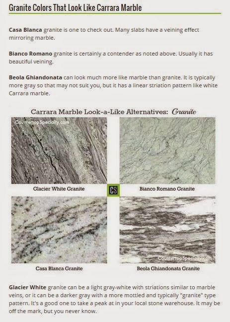
And there are several gorgeous granites that resemble marble.

WHITE DELICIOUS GRANITE

RIVER WHITE GRANITE

RIVER WHITE GRANITE

CASHMERE WHITE GRANITE

CASHMERE WHITE GRANITE

BIANCO ROMANO GRANITE
Remember that granite and quartzite are natural stone - so they will vary in striation and in intensity of movement. Some will be darker, some lighter, and some may have veins of other color. Once you have an idea of what you like, you will need to go on a hunt for the perfect slab.
There are some good ideas for fireplace walls, kitchens, master ensuites, etc. on my Pinterest boards and on my blog. But let me know if you want some personal help - I can give you a customized plan of action and recommendations for the areas you are contemplating changes in and take away some of that stress. Please also fill me in on what you have chosen for flooring or anything being replaced in the rooms where I recommended colors.
Regards,
Claudine
Hi Carolyn and Brian.
Thank you for sending the pictures so I could get a feel for your home and your style.
I know what you are going through.
I am at the end of a long renovation following a slab leak...
one thing just seems to lead to another... doesn't it?
I love all the wonderful natural light you have -
and I can see you have tried a few colors... ha!
You said you painted a bathroom in Silver Dollar? Was that Olympic paint?
I have recommended some Benjamin Moore and Sherwin Williams colors, but they should be able to color match if you would rather use the Olympic paint.
Generally speaking, I try not to change colors too much in an open space. Staying with one color in all the rooms that are visible to one another creates flow and continuity. Adding contrast creates the interest and the beauty. That being said, I recommend one wall color for these rooms, but some changes elsewhere....
.jpg)
I would use a soft white on the ceiling, in a flat sheen, including the beam ( although I would recommend a satin or semi-gloss for the wooden beam ) The same white satin or semi-gloss should be used on any trim or doors, (door casings, crown and base moldings, window casings, etc.
.jpg)
For the walls I recommend a beige that has a gray undertone (or a gray with a beige undertone) which will make your room feel calm and cool and the color will go with nearly everything.
I think it will be lovely in these rooms.
.jpg)
I also think there is a lot of 'one-tone' going on in your home right now,
so I would recommend adding some contrast!
Based on what you told me about the bathroom, I think some dark grays would be the best solution.
I would paint the bar cabinets and bottom area a dark/medium gray,
and I would do the same to this brick wall and fireplace.
.jpg)

Since this is a long room, the dark color at the end will provide a focal point, add a little drama
and update this look. If you are able, I would also add a big chunky wooden mantle.


To further delineate your cozy seating area, I would add a seagrass rug (because its dog friendly, and adds texture and will make a world of difference there - and its inexpensive too).


link here

seagrass rug

seagrass rug
link here
If you find it in the budget, adding crown molding and framing the windows with trim will make a huge difference and create a more custom look.
I'm familiar with where you live and I want to make your home feel as 'cool' as possible... so no colors that are too warm. In the kitchen I'm recommending a white for the upper cabinets and the same darker gray for the bottom cabinets and island. The white on top will keep it from feeling cave like, and the dark on the bottom will ground it and pull in the other grays in the home. You mentioned you were replacing the countertops, and I don't know if you have selected a material you like. I know you like the carerra marble look, which I wouldn't recommend for a kitchen. However, there are now quartz or man made countertops that mimic the carerra marble and that would be gorgeous with the colors I'm recommending. There are also some beautiful white granites that have gray and beige tones in the pattern that would be beautiful.
.jpg)
To help you visualize, here is some kitchen inspiration in similar colors:


Now, back to this photo for a minute....jpg)
I would include the bookcase built-in at the back of the room in the paint process,
and paint it the dark gray. It will be amazing!


THE COLORS:
Ceiling: Benjamin Moore WHITE DOVE in flat
Walls: (I'm recommending two colors - you need to test them to see which looks best in your space).
Sherwin Williams ACCESSIBLE BEIGE (my clients' all time favorite) (lighter than it appears here)

OR
Benjamin Moore REVERE PEWTER (my all time favorite - I have this on my own walls)

Revere Pewter
you can also try
Olympic Paints QUILL

Fireplace Accent Wall: (Flat)

Kitchen Cabinets - Uppers: (and the rest of the wood trim)
Benjamin Moore WHITE DOVE in Semi-Gloss
Kitchen Cabinets - Lowers, Bar, Built-In Bookcase:
Benjamin Moore CHELSEA GRAY in Semi-Gloss

Chelsea Gray
So, this is a great neutral background. I actually can't think of a color that doesn't work well with these colors, be it reds, greens, blues, yellows, or purples. So you can add color with your fabrics and accessories and change it up whenever you like, and your neutral background will still work.
The light in your home, your ceiling height, the size of your room, even the geographical area you live in - all effect color. That is why it is so hard to choose wall color. So make sure you test it first to make sure it goes okay in your house - and if it doesn't for some reason - I will suggest some other colors for you to try.
I probably gave you more information than you asked for - can't get me to shut up once I get started! Ha! If you have any other questions, please call or email or text me.
Good luck!
I probably gave you more information than you asked for - can't get me to shut up once I get started! Ha! If you have any other questions, please call or email or text me.
Good luck!


